HomEase — designing a calmer way to share a home.
Roommates don't fight about chores. They fight about ambiguity. HomEase is a shared-living app — tasks, expenses, group chat — that we put in front of seven real households to find out where the design quietly created friction, and where it earned trust.
My role
Research, usability moderation, synthesis, recommendations
Team
Kezia Kok · Ching-Hsin Chung · Christine Chen · Shantaisa King
Pillars
Listen · Interpret · Recommend
↓ THE PRODUCT WE TESTED
One app. Three jobs. Seven households watching it stumble.
Weekly chores assigned to a roommate, with reminders and recurrence.
Add, split (equal · share · %), and settle up shared costs.
House conversation with pinned messages for the things that matter.
7
Participants
3
Core tasks tested
30–45
Min per session
9
Design recommendations shipped
↓ THE THREE FLOWS WE TESTED
This week
Whose turn this week
Kitchen deep clean
Trash + recycling
Bathroom
Expenses · Summary
Clear balance
You owe Sam $14.20
Groceries
Sam paid
Utilities
You paid
Rent share
Caroline paid
House Chat · 4
Apt 3B
Wifi password is on the fridge — please don't change it 🙏
Rent due Friday. Venmo @devon-sf, no notes plz.
Trash night reminder: Wednesdays before 9pm.
Hi-fi flows redrawn from the team Figma — task tracker, expense splitter, group chat with pinned messages.
↓ THE LISTENING
We didn't ask if it worked. We watched what people did when no one was helping them.
Surveys tell you what people remember. Usability tests tell you what their hands actually do. Over three days we ran moderated, think-aloud sessions on a Figma prototype — laptop or phone, on Zoom — with seven adults living in shared housing.
Method
Tasks, not opinions.
Three realistic scenarios — create & assign a task, split an expense, locate a pinned message — run start-to-finish with no nudges from the moderator.
Recruitment
Real households only.
Adults 18+ in shared housing, 6+ months on both laptop and phone, no UMSI students or tech professionals — so we'd see real hesitation, not professional pattern-matching.
Capture
Two cameras, one truth.
Screen recording for the prototype, a second camera pinned on the participant. Words, hands, and faces — all on tape, all anonymized.
Posture
Watch. Don't rescue.
Positive feedback meant 'leave it alone.' Confusion meant 'this is the gift.' We optimized for finding hesitation, not for making the participant feel smart.
↓ WHO WE BUILT FOR
Two people. Same problem. Different anger.
Caroline · 23 · Grad student, Ann Arbor
“I understand everyone is busy, but I wish everyone would remember to do their chores.”
Underlying need
A neutral place to assign chores so she doesn't have to be the one who asks.
Devon · 30 · Remote SWE, San Francisco
“I mostly stay home, but that doesn't mean I should be the one responsible for the cleaning.”
Underlying need
Visible fairness — a record that proves the load isn't actually equal.
↓ WHAT THE TAPE TOLD US
The product is sound. The language is doing the damage.
Participants completed every task. They also got quietly stuck on the same three things — and every block traced back to a word, not a flow.
3 of 7
Expenses
"You borrowed / you lent" stalled half the room. People paused, re-read, then guessed.
"The 'you borrowed' and 'you lent' is a bit confusing." — U03
Design decision
Replace owe/lend phrasing with directional, plain-English copy. Add a category field so each expense reads like a sentence, not a math problem.
2 of 7
Settle Up
"Settle up" read as an action button when it was actually a summary view. Users tapped expecting to pay.
"I'm not sure what 'settle up' means here — does that mean I pay them or they pay me?" — U02
Design decision
Rename "Settle up" → "Summary" and add an explicit "Mark as paid" CTA inside each expense detail. Status and action stop overlapping.
4 of 7
Group Chat
Returning from Pinned to the live chat felt unanchored — users used the back button but lost context.
"I think I'm replying in the right place... it just doesn't highlight where I am anymore." — U06
Design decision
Promote pins from a side trip to a tab inside the chat header (msg · files · links · pins). Context never leaves the screen.
5 of 7
Home & Nav
Home felt like a list of obligations, not a snapshot. The bottom nav held the primary actions; the hamburger duplicated nothing.
"It would be nice if you can include a quick glance of assigned to who and due date." — U03
Design decision
Surface a today-at-a-glance card on Home (whose turn, what's due, expense balance) and mirror primary nav inside the hamburger so both habits are supported.
↓ THE PIVOT
We stopped designing labels and started designing trust.
Halfway through synthesis we noticed every confusion was the same shape: the app named the mechanic (“settle up”, “you lent”) instead of the user's intent (“mark as paid”, “you owe Sam $14”). The recommendations stopped being a list of fixes and became one principle.
Sketch · Tasks
Before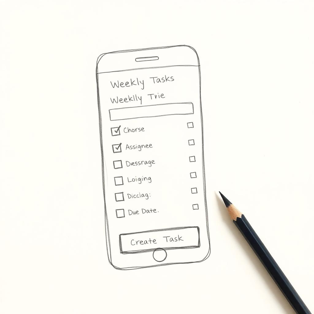
Early sketch — generic "Weekly Tasks" list, hidden assignees, the same chore-as-checkbox metaphor as every other app.
Hi-fi · Tasks
AfterThis week
Whose turn this week
Kitchen deep clean
Trash + recycling
Bathroom
Hi-fi — "Whose turn this week" makes ownership the headline. Days are explicit. Roommate names sit on the card so fairness is visible at a glance.
Sketch · Expenses
Before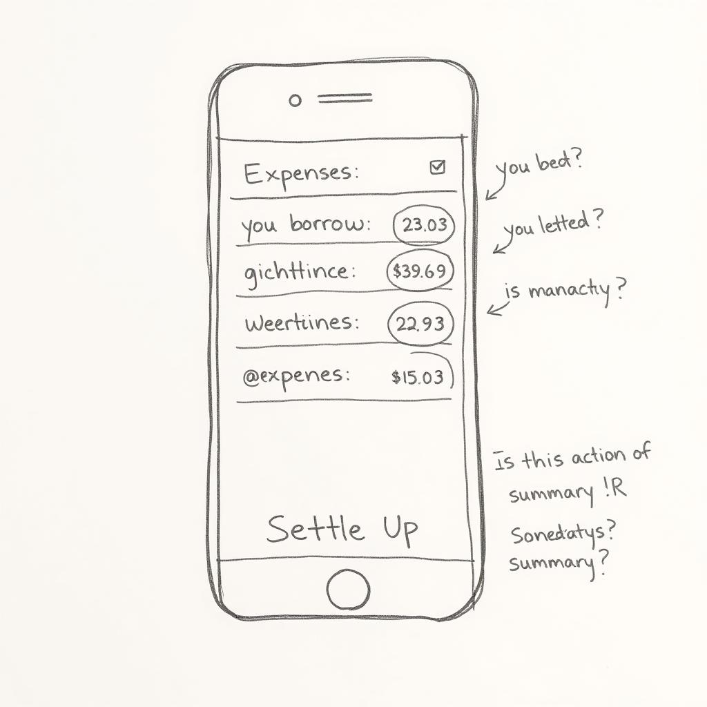
Early sketch — "you borrowed / you lent" + a "Settle Up" button that read as an action. Three out of seven testers re-read it.
Hi-fi · Expenses
AfterExpenses · Summary
Clear balance
You owe Sam $14.20
Groceries
Sam paid
Utilities
You paid
Rent share
Caroline paid
Hi-fi — one plain-English balance card up top, a category icon per row, and an explicit "Mark as paid" CTA. The sentence does the math for you.
Sketch · Chat
Before
Early sketch — Pins lived on a separate page. Returning to the live chat felt unanchored; users lost the thread.
Hi-fi · Chat
AfterHouse Chat · 4
Apt 3B
Wifi password is on the fridge — please don't change it 🙏
Rent due Friday. Venmo @devon-sf, no notes plz.
Trash night reminder: Wednesdays before 9pm.
Hi-fi — Pins moved into a tab in the chat header (msg · files · links · pins). You never leave the conversation to find a pinned message.
↓ WHAT WE RECOMMENDED
Nine changes. One throughline: name the user's next move.
Home & Nav
- →Add an at-a-glance balance + whose-turn card
- →Mirror primary nav inside the hamburger
- →Rewrite the task header in plain language
Task Tracker
- →Show days of the week explicitly
- →Surface every roommate's tasks (not just yours)
- →Add detail + filter; drop redundant checkboxes
Expenses & Chat
- →Rename "Settle up" → "Summary"
- →Add categories + a "Mark as paid" CTA
- →Promote Pins to a tab inside chat header
↓ WHAT I'M TAKING WITH ME
Usability isn't about the click. It's about the second of doubt before the click.
Every blocker in HomEase was a half-second of hesitation a survey would never have caught. Watching a user re-read the same word twice is the highest-bandwidth research signal there is — and it pushes you, every time, away from clever copy and toward honest copy.